FordTrip.
FordTrip is a conceptual product created in the Ford 2022 Intern Hackathon, which took place over 2 work days. This project was completed in a team with 4 other students. I provided UX research and design to create a prototype, while others in the team provided the back-end support so that FordTrip is a fully-functional product.
DISCLAIMER: Because of my non-disclosure agreement, this is the extent of my work I can publicly share about my summer internship. Reach out to learn more about my day-to-day work as an interaction design intern!
-
Involvement.
Interaction Design Intern
May 2022 - August 2022
-
Project.
Prototype a conceptual product in a two-day summer Hackathon in a team of 5.
-
Tools.
Figma
Problem Statement
Traditional navigation systems treat roadtrips as a dash from point A to point B, lacking an experience along the way.

Central Question
How might we design a navigational product that maps EV charging along with entertaining stops to make the roadtrip more enjoyable?
Who would be interested in a new navigational product?
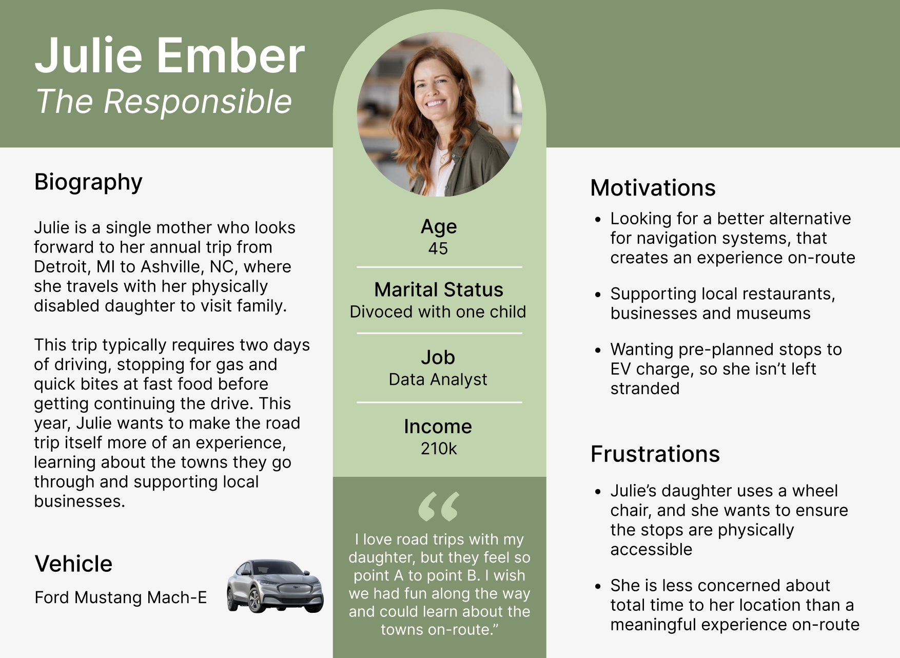
To demonstrate our target audience, my group created an example user persona.
Our formal product pitch is available here.
What would an experience with our product look like?

Our proposed customer journey map demonstrates how one persona, The Responsible Julie, may interact and react to our product.
This user journey demonstrates the steps taken for a successful experience, including:
Pre-planning a road trip
Indicating road trip priorities, goals and restrictions
What types of platforms are used
Medium
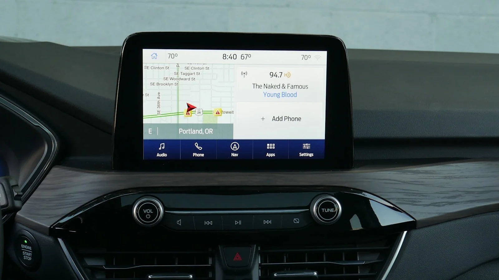
This product was designed to fit the in-vehicle infotainment interface (IVI).
This photo demonstrates what the IVI looks like inside the car on the 2022 Ford Escape. The system is placed between the driver and passenger.
For safe driving, everything needed to be designed with glance accessibility where users are able to learn basic information by glancing at the product, without need to swipe and tap through the system.
Secondary Research
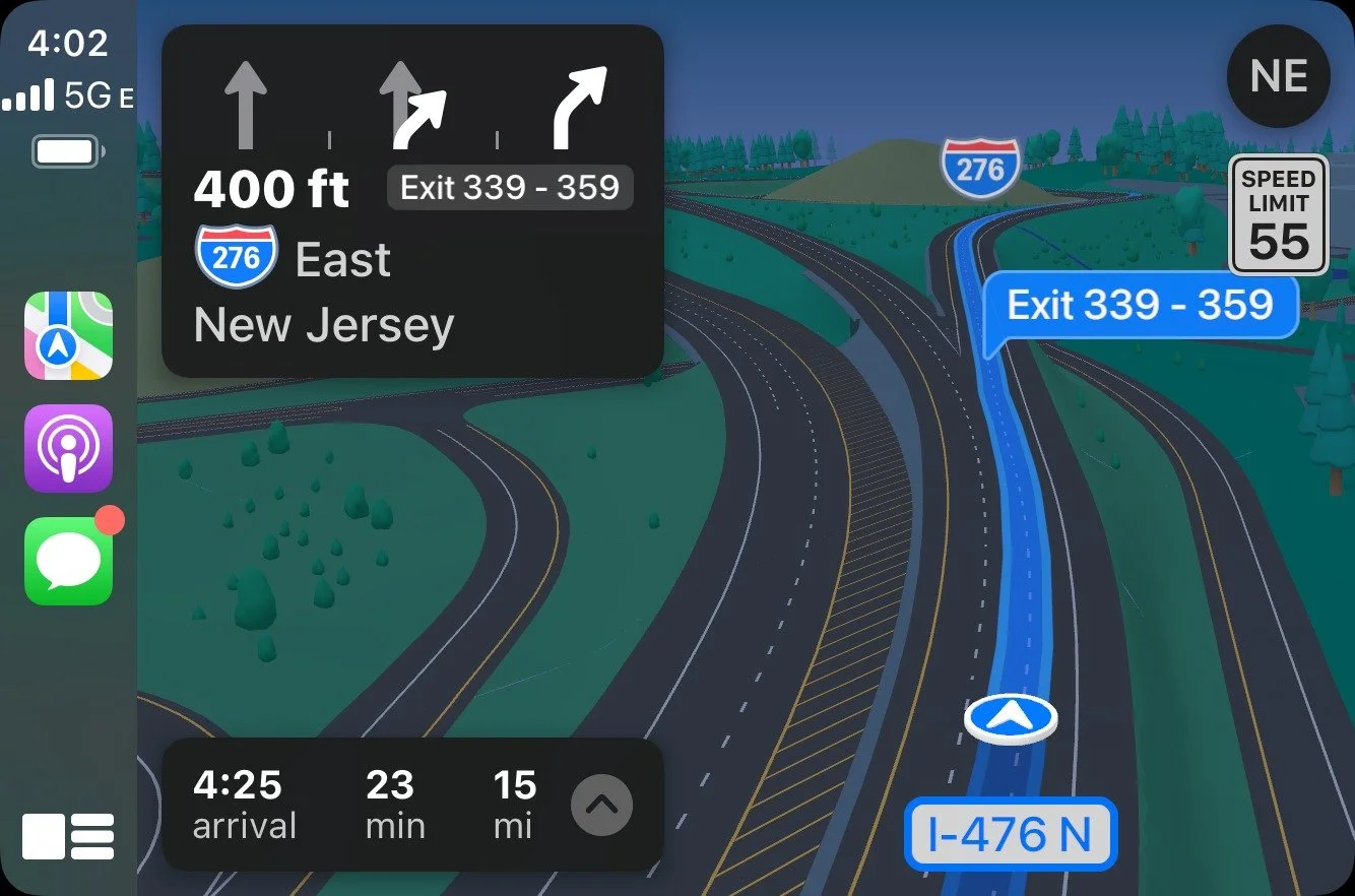
Apple CarPlay
-
Map full view
arrow indicator of yourself
highlighted route
ETA, minutes remaining, and miles remaining
Information displayed closer to driver than passenger (left side)
-
Include arrival, minutes and miles in FordTrip UX
Top left corner is for upcoming directions
Add an indicator of yourself
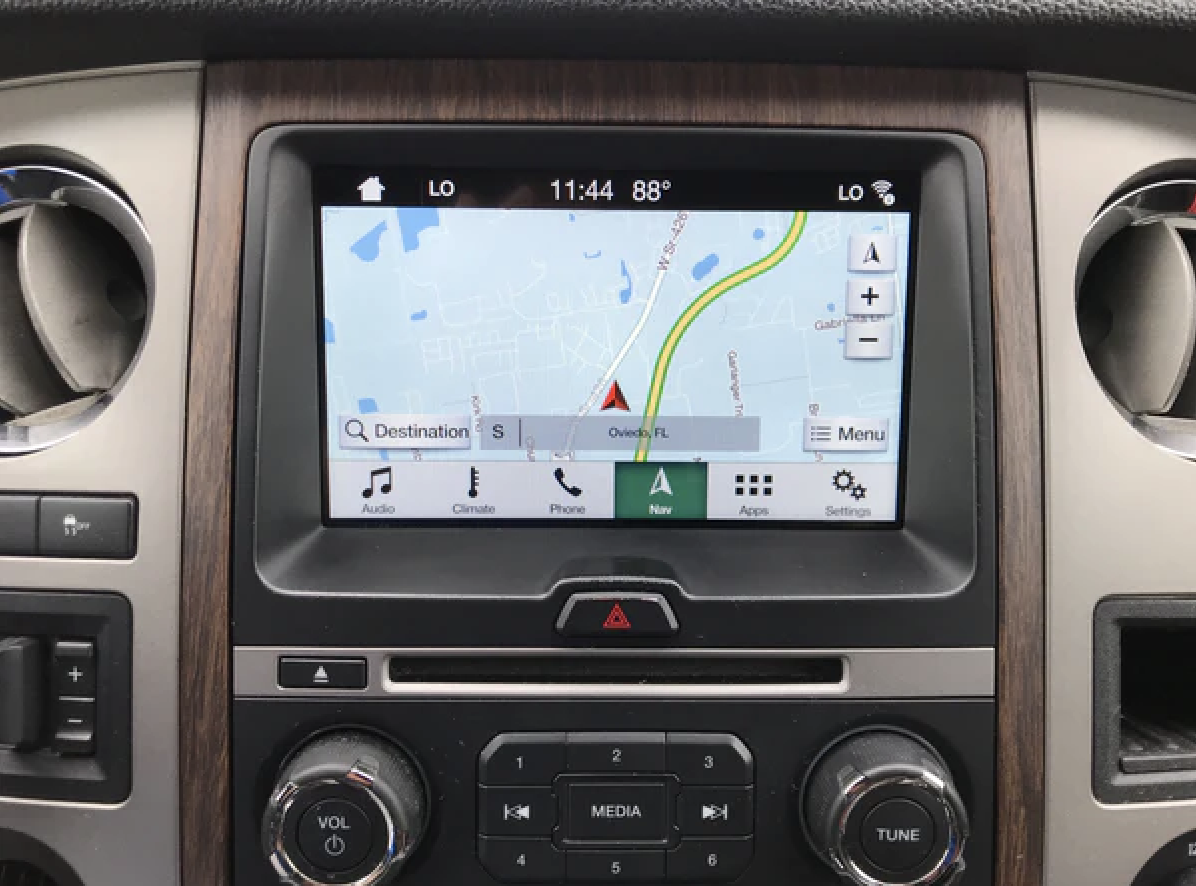
Ford Navigation
-
Screen real-estate is occupied by time and menu bars
Defined color pallet
Zooming capabilities on map
-
Stick to the Ford color pallet
Allow for space at the bottom and top for time and menu bars, keeps with the currently existing technology

Google Maps & Multi-View
-
Keep ETA, miles and minutes on the multi-view
Also keep speed limit
Map stays left, closer to driver
-
In multi-view design, map should be left and closest to the driver for glance effect
Music should have its own box, with the option to skip
Working with the givens

Ford already has a navigation system. Our product is proposed as an extension of that.
For that reason, we decided to keep the color pallet, font, and style the same so that the product can look cohesive along what already exists.
Content Inventory
What components are needed in this product to fit the projected user needs?
Map with directions
This navigational product, obviously, needs a map to tell the user where to go. This has to be usable at a glance for safe driving, so not too complicated. It should have an ETA and directions available on-screen as well.
Priorities indicator
Along with indicating starting and ending point, users will also indicate their roadtrip priorities. Because the product is recommending stops, users can indicate what they want those stops to be. If that’s hiking, learning about history, or listening to local artists.
Point A and B
Along with the map, users need to be able to indicate their starting position and where they want to go. This will take place at the beginning of the system’s boot-up.
Stops line-up
Users should be able to see, very clearly, what stops the system has lined up. These stops will also involve a rating system with user feedback. So, not only will they be recommended a stop, but see how other users have rated it in areas of family friendly, accessibility, and overall.
What do users want and need?
An initial interview with real users, my friends and family that drive, gave me insight into how the product could look and feel.
“I'm so used to Carplay. When I get in my car, it’s just immediately plugging in my phone to get Carplay up. This new product would have to look similar I think for me to make the switch.”
— Real driver #1
“I really like how my system now has a multi-view option. It lets me see my song and maps at the same time. Then if I wanna skip my song or change something with my map, I can do it from right there. It’s nice to just look down and see everything.”
— Real driver #2
“I think it’d be sweet if you had some ties to what the destination looked like. If that was a photo or something. Then people could get a little excited on the route about where they’re going.”
— Real driver #3
High fidelity: First draft
-
Opening page
The user is able to type their target destination, along with a few pre-sets for common travel destinations. The background is a travel photo to follow the suggestion of interviewee #3.

-
Multi-View
This homepage demonstrates the map, upcoming stops, current song/playlist and the EV charge remaining in the car. The background, at this point, has switched to a stock image of the destination.

-
Events page
When users tap on the multi-view events box, the user will be re-directed to this full view page. Here, they can see an image of the location and choose to add or remove it from route using the buttons.

Criqitues from the users, group, mentor and myself
High-fidelity: Final version
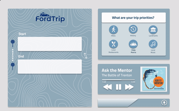
Plan trip
Users will input their starting location, final destination, and indicate trip priorities.
Also visible is the currently playing song and their EV charge.
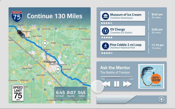
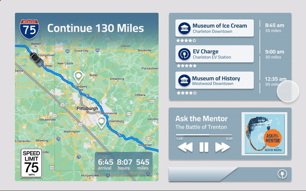
Stop recommendations
Users will see an itemized agenda of their stop recommendations. Including time, miles away, and overall rating.
When clicked on, users can see more detailed ratings and accept or deny the recommendation.
Audio recommendations
The service also provides music or podcasts recommendations on route.
The user will be prompted with a potential audio, based on their location and trip priorities, and can accept or deny it.
See full walk-through video here!
Designing for drivers
-
![]()
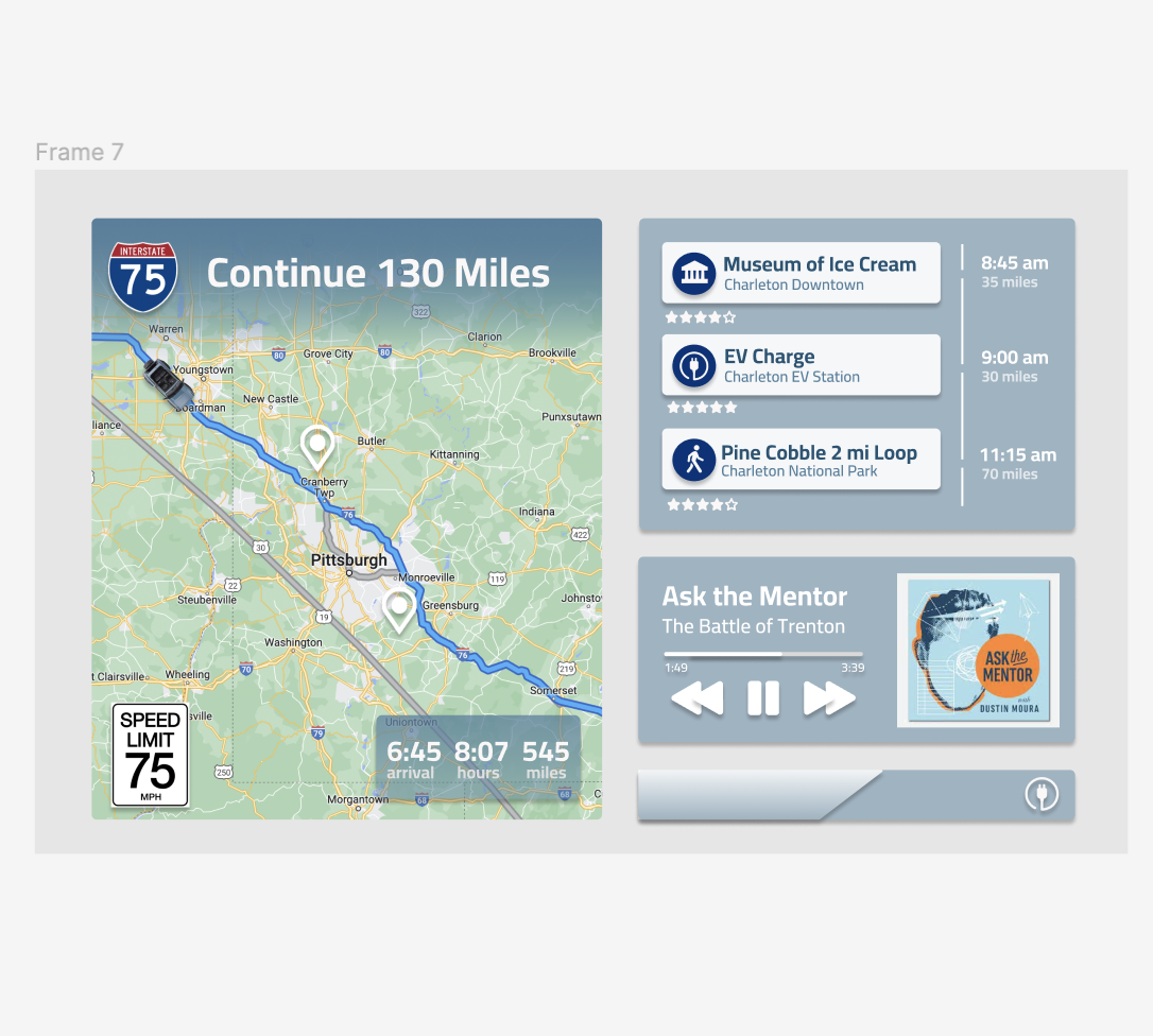
Glance capability
Users can see the map (with ETA and next direction), events (with ETA and rating), song (with the option to skip and pause), and EV charge all in one page.
-
![]()
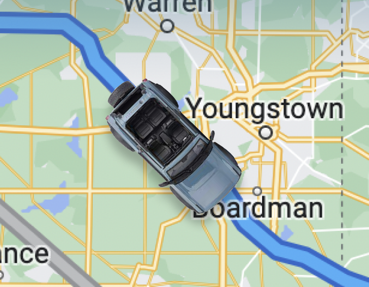
Icon
The driver can see themselves as indicated by a tiny model following the map path. On this wireframe, you can see the teal bronco as the driver.
-
![Next steps on map]()
Next steps on map
The events are not only displayed in the events table, but as pin icons in the map itself. That way, the drivers can see visually how far away they are.
If I had more time…
I would have liked to:
demonstrate our audience through more personas, user journeys and storyboards
perform usability testing and make the necessary design changes
work with developers to enhance our real-time feedback system, and how it appears on the UI
translate to different languages

This project was a very positive experience of my internship! I loved working with other interns at my level and learning from their various skills, both as designers and programmers.
This project had valuable lessons for:
managing a fast-paced project
improving communication with programmers