Michigan Founders Fund.
During the Fall of 2021, I applied to the U-M School of Information Design Clinic, a program that matches technology-interested students to small businesses in need. I was matched to my request, the Michigan Founders Fund. After researching their brand, I was impressed with how many small business they were able to support through their organization which, because of my interest to join the Design Clinic, matched my own.
I originally joined the MFF team when they were formally the Ann Arbor Entrepreneurship Fund. During my involvement, the organization transitioned from an Ann Arbor-based to a state-wide organization, following through with a website re-design, logo change, and growth in outreach.
Because this partnership was conducted through the U-M Design Clinic, I also completed weekly project/product management seminars and completed all tasks under a mentor relationship.
-
Involvement.
UX Design Intern
August 2021 - December 2021
-
Projects.
Heuristic Evaluation, User Interviewing & User Flow, High-Fidelity Prototyping (solo)
Competitor Analysis, User Mapping, UX/UI Web Design, Logo Re-Design (group)
-
Tools.
Miro
Adobe Photoshop
Figma
Problem statement
“Ann Arbor Entrepreneurs Fund” is transitioning to “Michigan Founds Fund”, where the organization will increase their membership from local to state-wide. Their company is lacking a fresh website, logo and brand identity that recognizes their expansion and caters to their growing network.
Central question
How might we design a website and logo that supports the company’s growth while remaining familiar and true to the longstanding members and the identity roots of the organization?
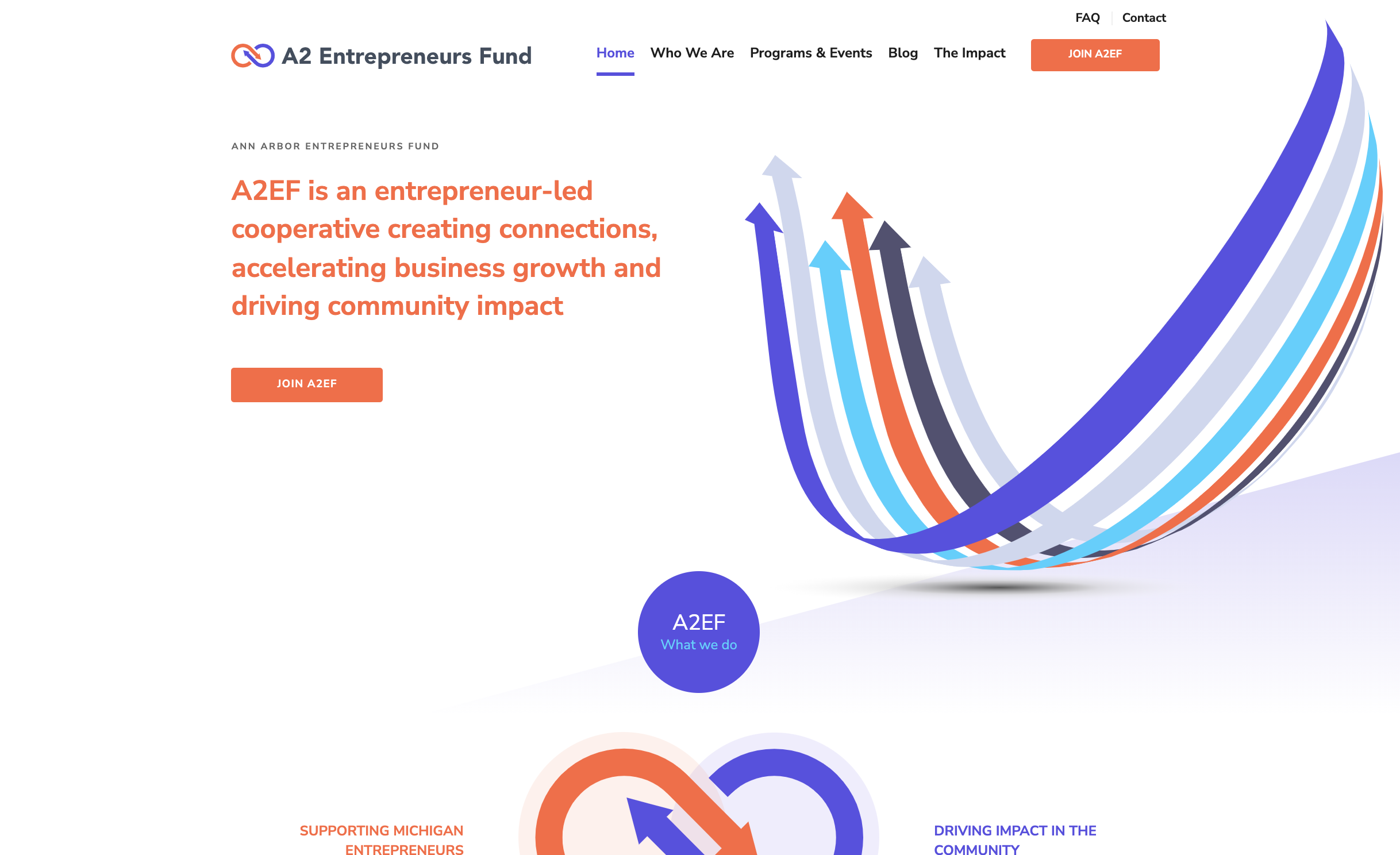
Website @ start


Understanding the culture
Through user interviews, I met with current users and MFF employees to understand their company culture in their own words and, from that, the desired product’s appearance and impact.
Brand Culture
Forward-thinking, empowering
Exchange / Network
Knowledge, Value, Passion
Social Responsibility
Feeling
Sense of belonging, purpose, and responsibility to the community
Informed, Educated, Committed
Empowered, Energized, Respected, Inspiring
Impact & Tangible Values Provided
Vehicle: Connect with other founders via social events
Personal: Mentorship, learning opportunities, support, personal growth, motivation
Business: Funding opportunities, increased success, partnership for philanthropy,
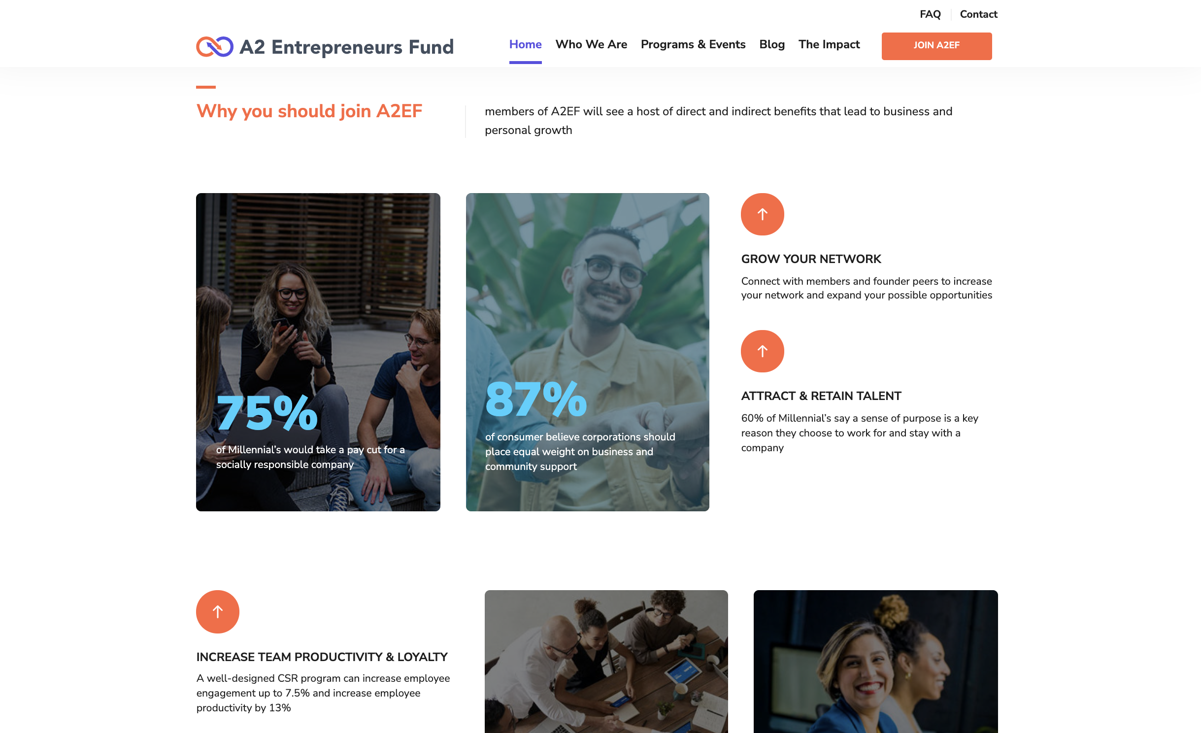
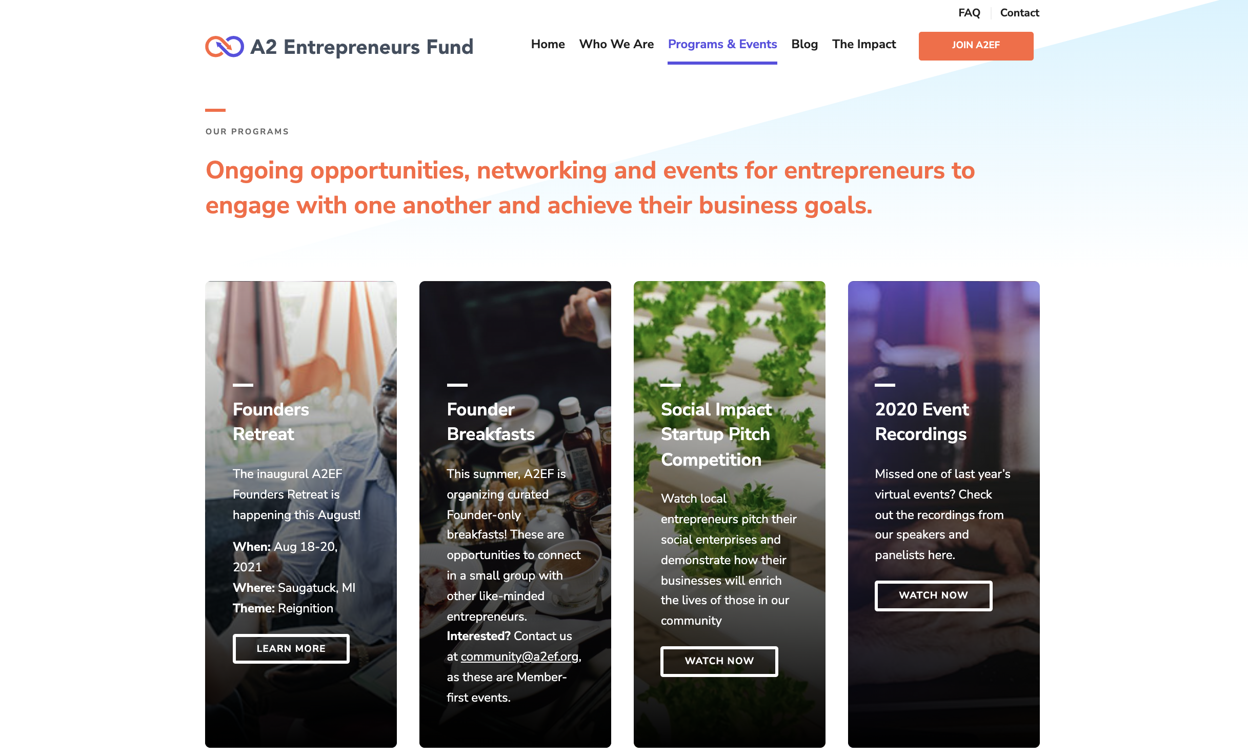
Reviewing the mature product

Homepage of the mature product
My first solo project was the heuristic evaluation of the current website.
I first started by interviewing the CEO of the Michigan Founders Fund to get a sense of their desired missions, values and goals to be portrayed on the website. Though this isn’t directly related to the UI, it was important to have a full understanding of the company before viewing their digital product.
I created a deliverable to the CEO using Jakob Nielsen's 10 general principles for interaction design, adding on an 11th heuristic of accessibility.
A ranked the heuristics on a scale of excellent, good, average and poor, with descriptions of how I determined these ratings. Below are a few examples.
Understanding the users
For another round of user interviews, we reached out to entrepreneurs, both of A2EF and unaffiliated, to hear about their backstory, needs, and what they look for when joining a community. The bulk of the interview, however, was monitoring how they navigated the website via a screen sharing demonstration and their related comments.
Example questions
Key takeaways
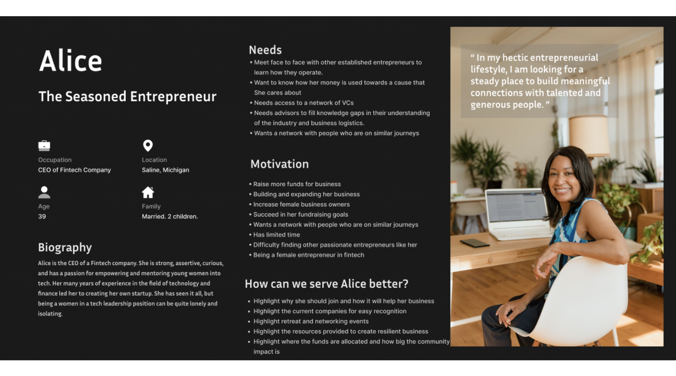
Illustrating our users
Personas: The Seasoned Entrepreneur / The Venture Capitalist / The New Entrepreneur


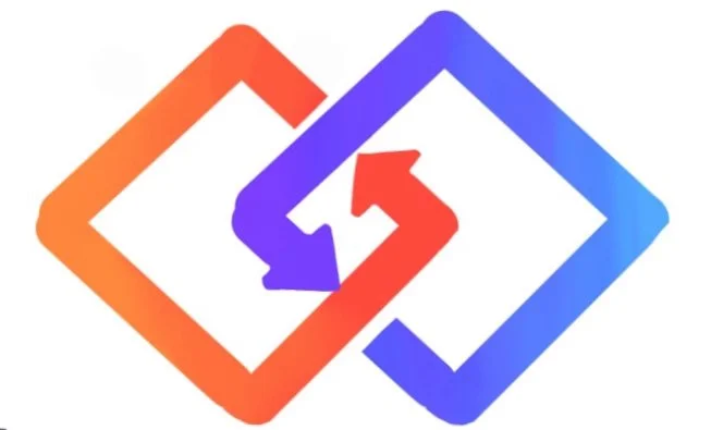
Logo re-design
Along with re-designing the website, our client had requested a new logo. The fund was transitioning from an Ann Arbor-based organization to state-wide.

Former logo for Ann Arbor Entrepreneurs Fund
After speaking with the CEO, she requested that the logo bring familiarity from the previous logo, while somehow demonstrating the growth of their company expansion.
New logo
Our proposed logo uses a:
gradient of colors to keep familiarity of the previous logo and company colors while showing evolution
squared but rounded edges to demonstrate a chain-like linked network
infinity sign to further keep familiarity, though progressed through these changes

User flow: pushing for connection
We used our own research to develop a user flow that maps out our future system.
Our main goal is guiding users towards events instead of pledging membership immediately, since members were more likely to join after attending events, from our own research.
The user flow, made on Miro, also represents if the information will be viewed as a “learn more” button or through a gallery feature.
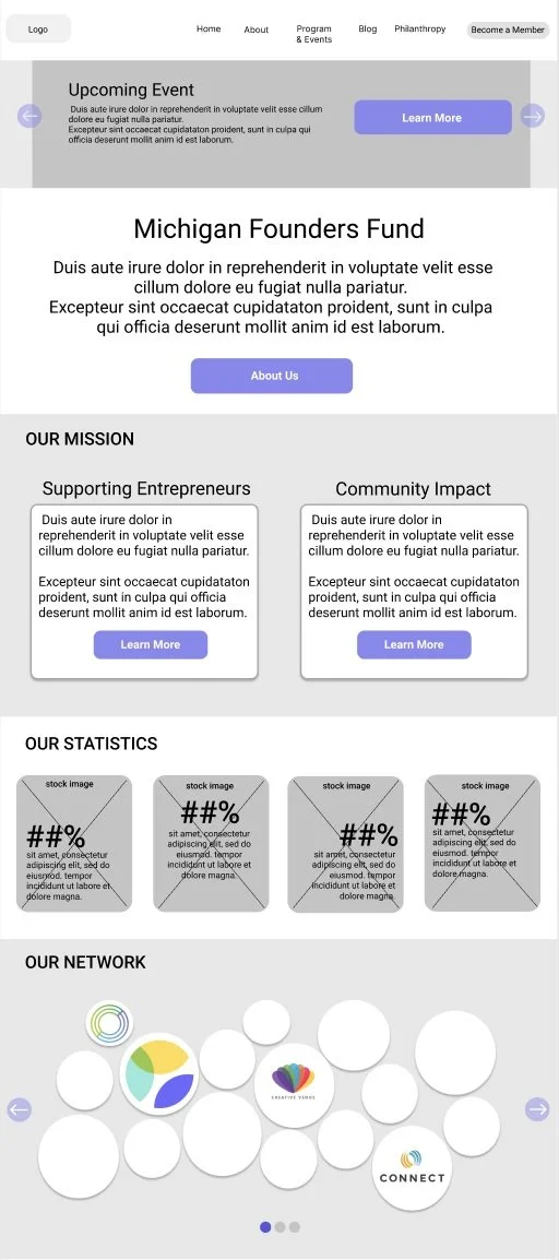
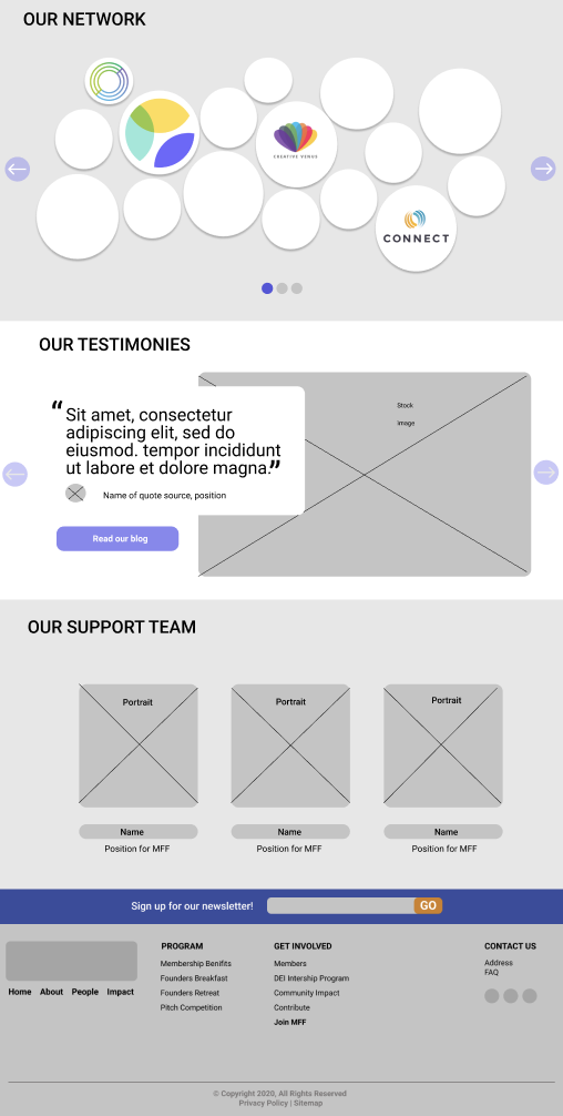
Low-fidelity
A low-fidelity prototype was created to illustrate the layout of the new pages. These products follow the updated user flow, sitemap, and website action items that were created based on the user interviews.
-
![]()
Homepage pt. 1
-
![]()
Homepage pt. 2
-
![]()
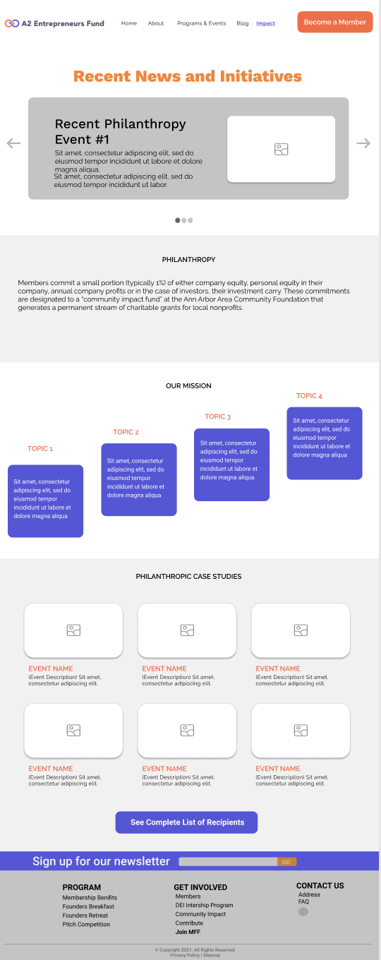
Philanthrophy
-
![]()
Join
-
![]()
Program & Events
-
![]()
Aboout
-
![]()
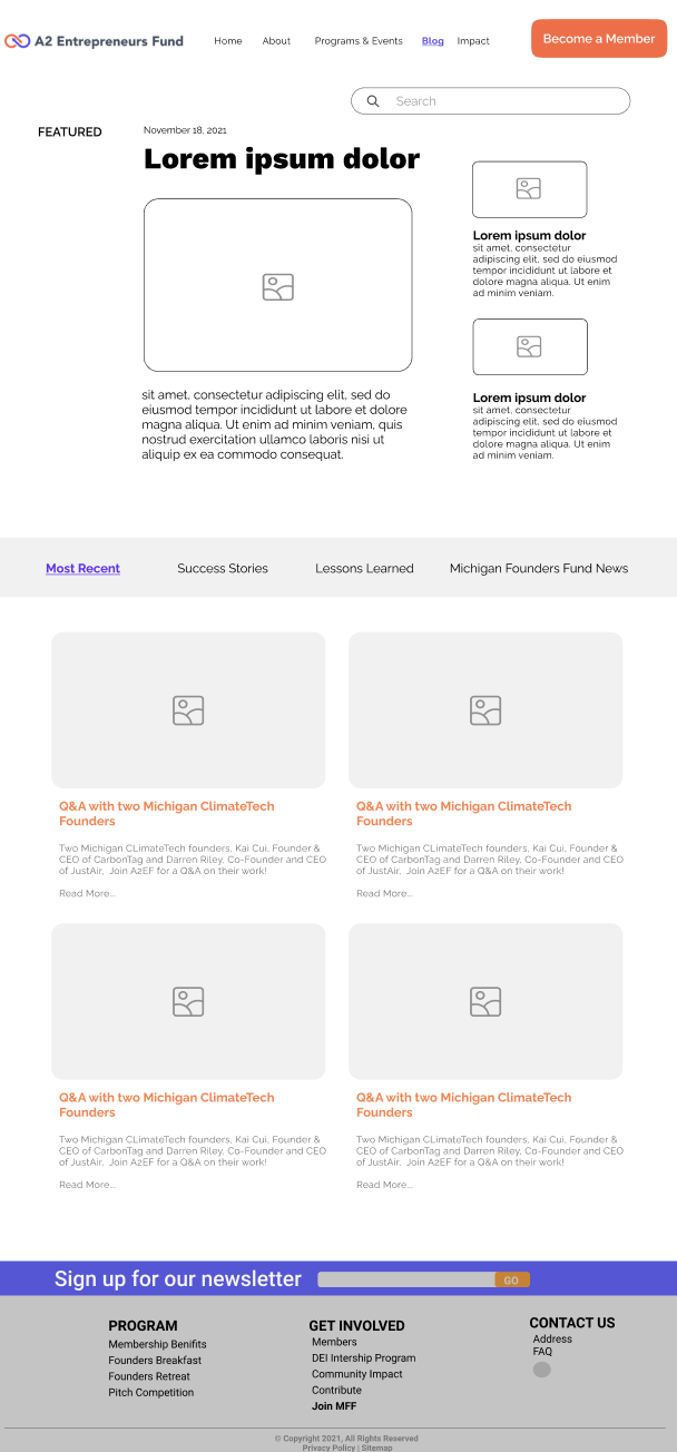
Blog


Usability testing

Template from one of the five usability test tests.
The team asked current members and unfamiliar entrepreneurs to participate is usability tests to see if our low-fidelity designs were meeting the needs of users.
In addition to asking for general impressions, we had specific action items to complete on the website (for example: sign up for the newsletter), that were later ranked with their completion time and ease. This demonstrated what needed to be changed for the next version.
Key takeaways
Company logos.
Current member’s logos should be displayed prior to their testimonies. Logos are more engaging, colorful and familiar.
Images.
Include images whenever possible to accompany events, blog posts, and quotes to look more engaging and legitimate.
Header.
A sticky header encourages user flow throughout the site and exploration to more pages.
Color.
Positive feedback keeping the traditional, purple and orange hues to keep familiarity in the website for current members.
Events.
Very positive feedback of event design that allows immediate implementation to a Google/Outlook calendar.
Logo layout.
Instead of using the different size circles to show company logos, use the same size. The differences appear like a rank.
Search bar.
Include a search bar for the blog section to parse through posts with more user control.
Homepage.
Move the upcoming events lower on the homepage. The first thing should be the mission statement.
Updated designs & High-fidelity
-
![]()
Homepage 1
-
![]()
Homepage 2
-
![]()
About
-
![]()
Events
-
![]()
Blog
-
![]()
Impact
-
![]()
Become a Member
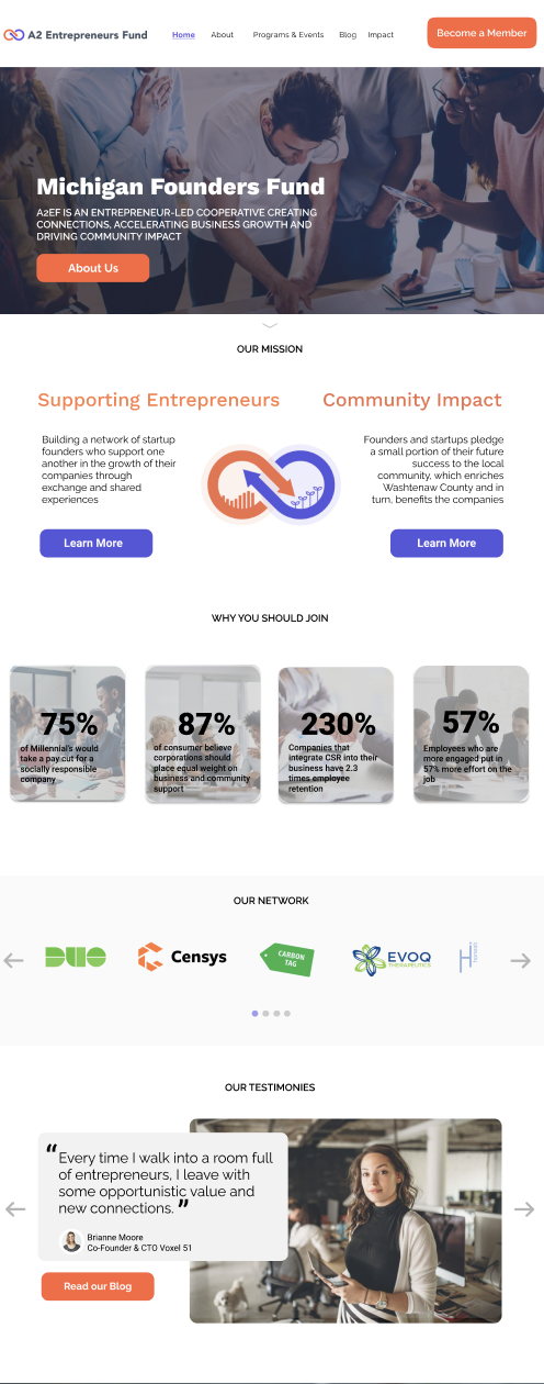


High-fidelity prototype
With these takeaways from usability testing, I designed a high-fidelity prototype of the homepage. The remaining pages remain low-fidelity but were re-worked with the findings of the usability testing.
We also created a style guide for font, color and elements to that the pages may look more consistent together and allow for future design changes.
Lasting impact

As I finished my involvement with MFF and the U-M Design Clinic, I am very reflective about what this organization has meant to me. This was a great opportunity to put my UX work to the test in a very safe, collaborative and inclusive environment. In addition to the hard skills of UX, user research, and design that were developed, this group taught me a lot about collaboration and communication in the technology space, specifically, how to conduct user research and design in groups so that everyone feels equally represented. I am very fortunate to have had this experience!
If I had more time, I would have:
researched more potential users, and designed personas to match
conducted more usability testing of the most recent product
created a mobile-accessible version of the site