The final product
A customizable, dynamic, and feedback-oriented redesign of one of the highest-traffic areas of Expedia Group partner products (the side of the website that hoteliers see).
What I did:
Developed a new user flow from the ground up, incorporating feedback mechanisms for future versions to ensure continuous improvement.
Introduced customizable homepage options for partners, allowing them to tailor the experience to their unique workflows, while also gathering insights into their preferences for data-driven decisions.
Led hierarchy explorations considering diverse user types and their processes to ensure the platform is adaptable, efficient, and accessible for all partners.
The starting place
Our partners are busy, and sometimes the opportunities we suggest don’t fit their workflow or feel relevant at the moment.
Objective:
Give partners control over when and how opportunities appear in their workflow.
Help them take action at the right time, without added stress.
Learn why recommendations are skipped to improve future coaching.
My impact
This project was heavy on discovery work, and it led to a final UI that had hidden depths.
What I did:
Establishes a scalable, user-centric foundation for continuous evolution based on partner feedback and preferences.
Positions the company for growth and competitiveness by improving partner retention, satisfaction, and overall platform performance.

Why it works
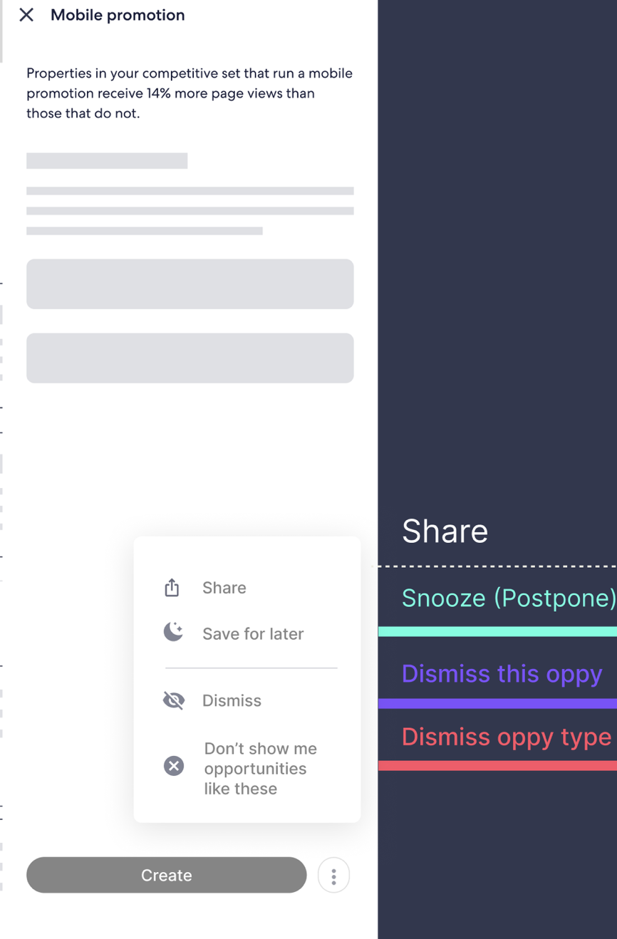
Previous Approach: EG presented partners with opportunities, offering only two options—accept or ignore. Those who chose to ignore it couldn’t remove the opportunity from their view, leading to clutter and preventing them from seeing other, more relevant opportunities.
New Approach: Treats opportunities like shopping for clothes, where partners have multiple options:
Put the opportunity on hold
Avoid it entirely
Get a second opinion
Move forward with completing it
Each choice provides valuable insights into how partners feel about the opportunity, helping us refine future recommendations and improve the overall user experience. This eliminates the need for an additional feedback form to gather the same information.
Zooming out
Obviously, how we treat opportunities directly impacts the layout and presentation of the page. With the new approach, opportunities are no longer weighted equally, and their treatment varies depending on the user's choice. This leads to a more dynamic and personalized experience, where the page adapts based on partner interactions.
As a result, the page now features several new elements:
Badges: Indicate the status of opportunities, such as whether they are on hold or snoozed, with a countdown to when they will become actionable again.
Timers: Display the time remaining for opportunities that are being snoozed, giving users a clear sense of urgency or a reminder to come back and engage.
Dynamic Visuals: Opportunities that are avoided or ignored will visually fade or be placed in a separate section, reducing clutter and helping partners focus on what matters most.
See the prototyped experience
What went on behind the scenes
Challenges & Next Steps:
Due to budget cuts, we couldn’t fully develop the Northstar design, so the video shows a simplified version. After discussions with the development team, I scaled back certain features for milestone 1.
Before concluding, I created a timeline for future CDs, including:
Monitor Feedback: Track user actions and feedback to improve the design.
Incorporate North Star Designs: Integrate revised North Star designs in future phases.
Gain Partner Insights: Gather insights through user actions and optional feedback forms.
Next Steps:
Train the algorithm: Use partner feedback to improve recommendations.
Add Northstar designs: Once possible, expand to the full North Star flow.
Iterate and improve: Continue refining the design based on new insights and feedback.