Mia Turco Photography is a portrait and event photography business that I started in 2016.
To date, I’ve worked with over 500 clients for senior portraits, professional headshots, thespian production posters, weddings and more.
Mia Turco Photography.
-
Involvement.
UX Researcher and Designer for self-started business
Aug 2020 - Sep 2020
-
Project.
Solo UX research and design for a website that’s desktop and mobile accessible.
-
Tools.
Adobe Lightroom and Photoshop
Squarespace
Problem Statement
Mia Turco Photography is conducted entirely through Instagram and word-of-mouth recommendations. This can feel amateur and unprofessional to potential clientele, and the business lacks the home base of a website for questions, pricing, and contact details.
Central Question
How might I design a website that showcases my style, presents pricing and FAQs clearly, and encourages booking?
Competitor research and benchmarking
The competitor research process is always very helpful for me. From it, I can determine which characteristics are standard in the industry and should be used in my own design. It also allows sparks inspiration for unique add-ons to my own site.
For this, I examined 5 local photographers’ websites.

Elements: dark color pallet, one demonstrated photo, side navigation bar, non-adjustable to mobile version.

Elements: black background, one demonstrated photo, limited colors, overlaid logo and image, non-adjustable to mobile version.
Elements to include
-

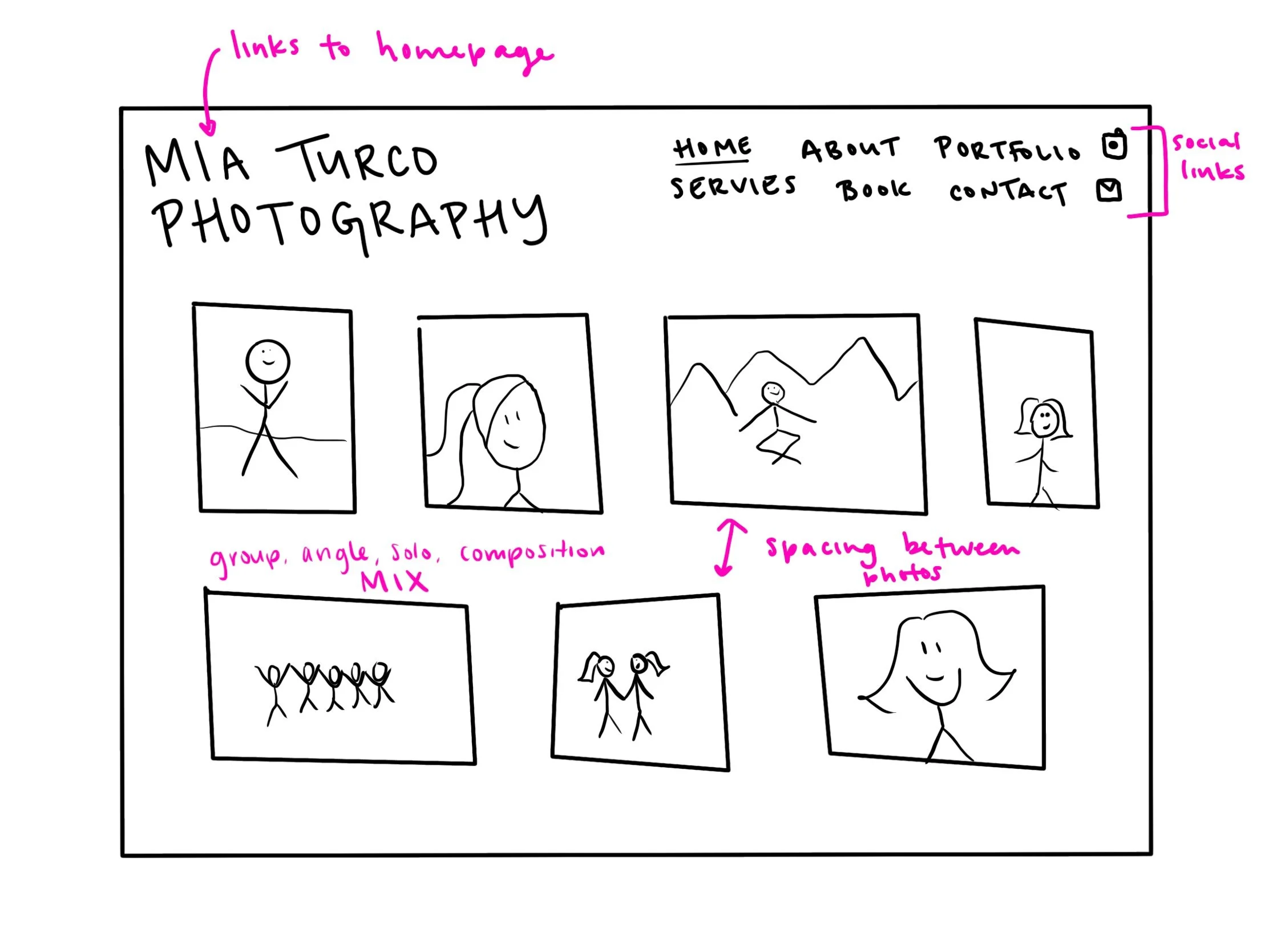
Header
A header with multiple tabs is standard. There needs to specifically be pages for pricing and options to contact.
-

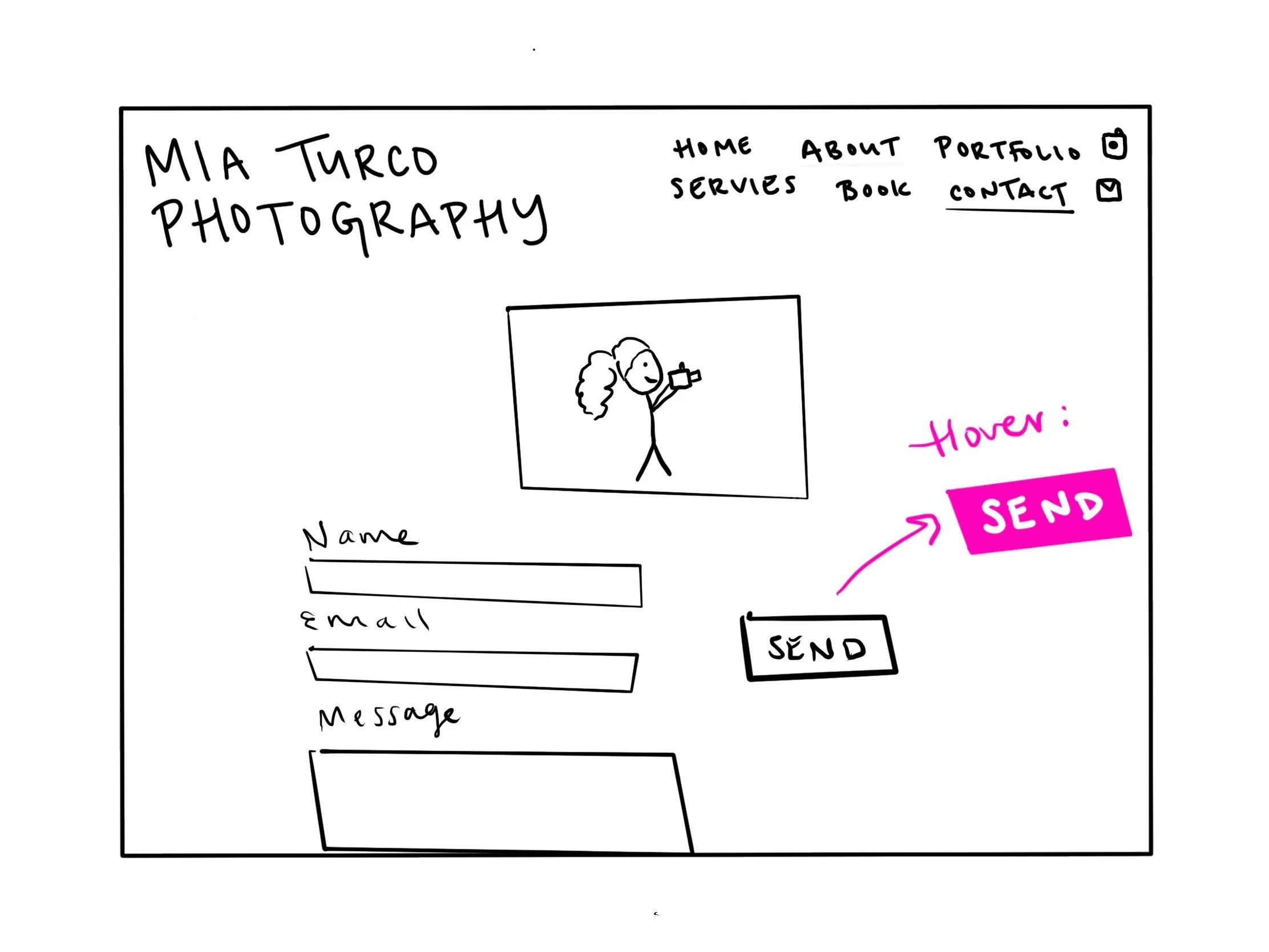
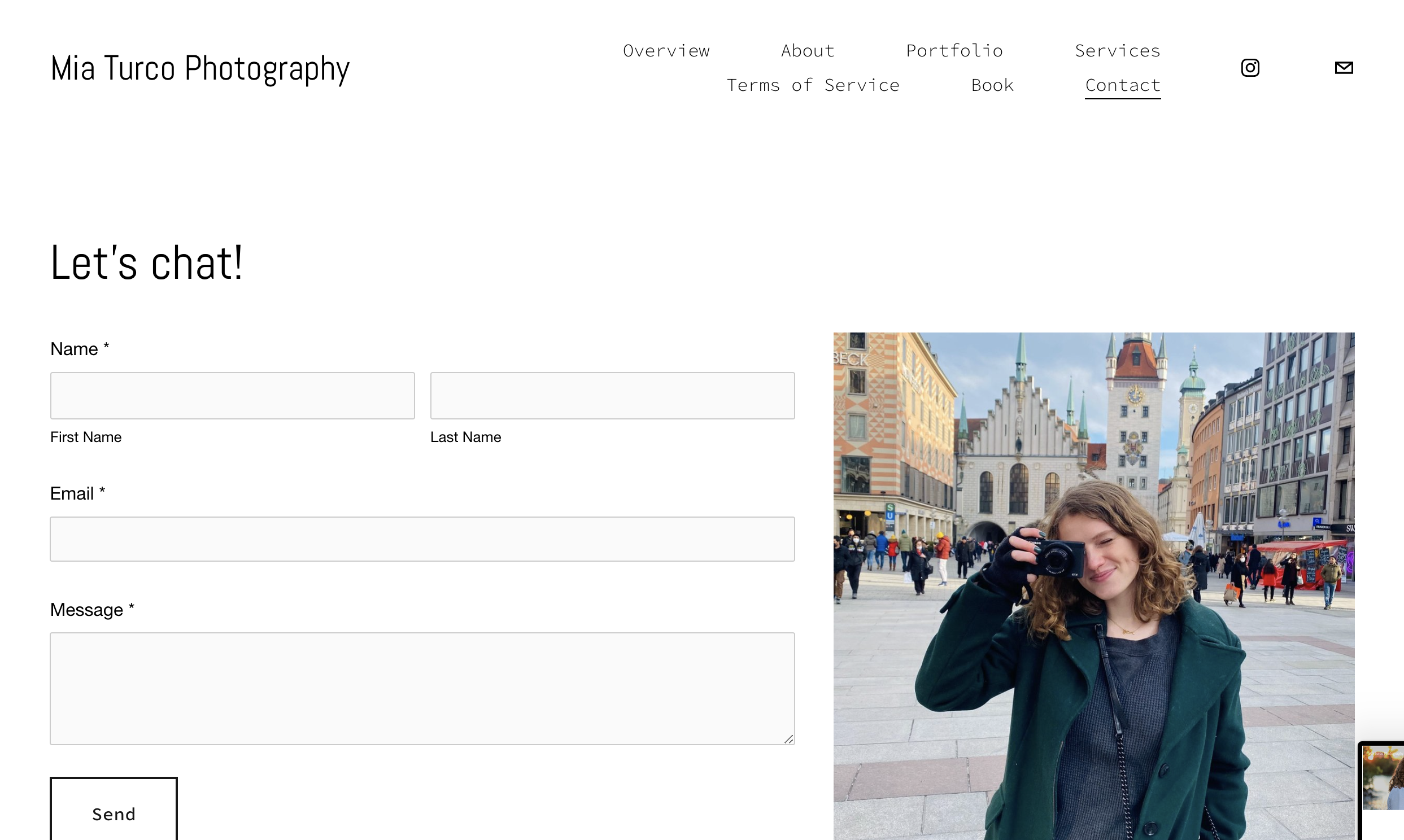
Contact
There should be a contact page on the site, complete with fill-in-the-box areas for name, email, and the message itself.
-

Range
A portfolio should showcase a range. This includes varied solo and group shots, different locations, and unique poses.
Elements to change
-

Price Transparency
Most photographers required a client to email to ask about pricing. This felt like a confusing and stretched-out process to me, and I wanted my clients to know upfront if I was within their budget.
-

Popping Portfolio
Many websites did a gallery, one-by-one portfolio. Although this lets users see each photo clearly, I wanted clients to be wowed with a big, colorful portfolio. This also allows a greater selection, so that users are more likely to find something within the first look that they like.
-

Client Privacy
Some photographers used their websites as a means of providing client photos after a shoot. They were not password protected. I wanted to allow clients privacy in their photos and only used pictures for my portfolio after consent.
Style guide
Setting intentions
Colorful, outdoor style
Vibrant photos from all seasons
An array of images upon entering the site
Buttons and links are black and grey to allow photos to attract attention
Inclusive to all
Varied images of groups, single shots, men, women, and ethnicity
Site will be accessible and adjustable for mobile, tablet, and desktop
Built-in keyboard accessibility through the tab key
Young and fresh
Links to Instagram
Showcased photos are minimally staged (laughing, movement, props)


Content inventory
Along with planning for the style of the website, I mapped out the content it would hold. This was partially based on standards found through competitor research. Though most of it is based on my most frequently asked questions with users themselves (what’s your pricing? what’s your email? what’s your portfolio? etc). This website was intended to be a home base for clients, so it’s all about the users.
1. Overview portfolio with varied images
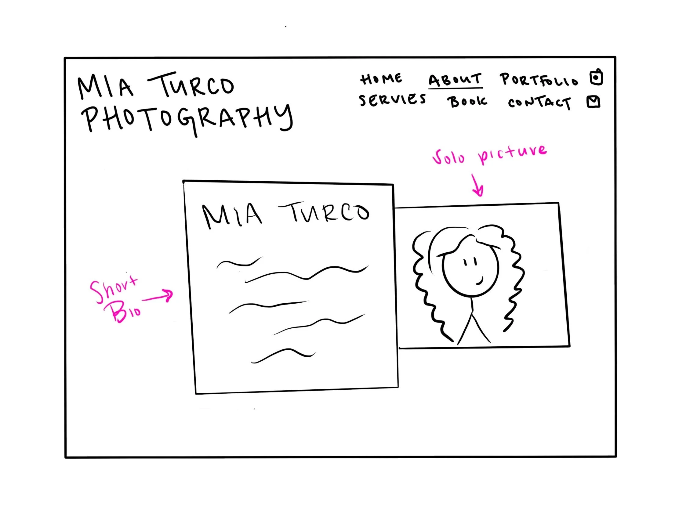
2. About page, including a photo of myself and personal details
3. Portfolio (with consented clients) of multiple photos from one shoot
4. Pricing breakdowns and services
5. Terms of service & FAQs
6. Booking Calendar
7. Contact
Sketches
High-fidelity


Mobile compatibility
-

Home Page
Crunches photos together
Minimized space in between elements
Shrinks all images
-

Header
Available through a header icon in the top right corner
Drop-down menu fills screen
-

Booking
All the same information and pricing as desktop
Smaller size, smaller padding
-

Contact
Photo is moved to the bottom to prioritize the email
Message box presented small, and expands only if message is large
Video walk-through
An exemplary user reviews the portfolio, reviews the portfolio, goes through the process of booking an appointment and sending an email.
See for yourself!
Next steps
Moving forward with this project, I plan to:
update my portfolio with recent photos that capture my changing style
include more gender and racial diversity within my portfolio and homepage to be more inclusive to all clients
